Close to 300 million people worldwide live with color blindness. And for them, the way a website or app uses color can make all the difference. Low contrast text, unclear charts, or hard-to-spot buttons aren’t just small design flaws for them, but everyday barriers that make using digital content unnecessarily difficult.
This is why color palette accessibility matters. It helps choose the right color combination that works for all.
Overview
What is Color Contrast Ratio?
Color Contrast Ratio is a measure of the difference in brightness between two colors, typically text and the background. It ensures content is readable, especially for users with low vision or color blindness.
How to ensure Color Palette Accessibility of Website Design?
- Ensure Sufficient Contrast
- Choose Colorblind-Friendly Colors
- Check Colors in Light and Dark Mode
- Test Colors in Real Use
- Test Color Contrast against WCAG Guidelines
- Adjust Colors for Compliance
- Repeat Testing
What is Color Contrast Ratio?
Contrast Contrast Ratio shows the difference in brightness between two colors. It usually compares text and background on a website. This helps you check how clearly the text stands out, and the content becomes easier to read.
Color contrast is usually written as a ratio, where a high ratio means better visibility. For example, black on white has a high color contrast ratio and gives you a 21:1 contrast. However, red on white gives you only 3.9:1 and white text on white background is 1:1, which means no contrast.
Hence, The WCAG has set minimum contrast levels for accessible web design. For normal (small) text, you need at least 4.5:1. For large or bold text, 3:1 is enough.
Read More: Accessibility Color Contrast Testing
Picking Accessible Brand Colors
Choosing brand colors is not just about looks. It is also about making your content usable for everyone. Some people see colors differently, and others may have low vision or color blindness. That is why accessibility matters when picking a color palette.
- Define Your Brand Personality: Start by choosing colors that reflect your brand’s tone. Then, refine them for accessibility.
- Build a Color Hierarchy: Choose a primary brand color, one or two secondary colors, and neutral tones (like grays or off-whites) for balance. Make sure key combinations pass contrast checks.
- Test Brand Colors for Contrast: Even your signature color should meet accessibility standards when used for text, buttons, or backgrounds. Tools like BrowserStack Accessibility Design Tootkit can help you test your website thoroughly for accessibility issues.
- Create Accessible Accent Colors: Use accent colors to highlight calls to action. However, ensure they stand out from the background and other UI elements for users with visual impairments.
- Design for All Audiences: Simulate how your brand palette looks to users with color blindness or low vision.
- Document Your Palette: Add accessibility notes to your brand guidelines, including contrast ratios and usage rules. This keeps your brand consistent and inclusive.
- Keep your colors consistent: Use the same shades across your site, app, and ads. This builds trust and helps people remember your brand. If your colors change too much, users may get confused.
Examples of Accessible Color Palettes
Below are some color combinations that match different accessibility levels. These examples follow trusted accessibility standards.
Level A (Basic Accessibility)
Level A is the most basic level of accessibility defined by WCAG. Interestingly, for color contrast, It doesn’t enforce any minimum contrast ratio between text and background.
Level A focuses more on removing major barriers like:
- No keyboard access
- Missing alt text
- Unclear navigation
But it does not require designers to meet specific color contrast ratios for text.
Level AA (Recommended for Most Content)
Level AA sets the standard contrast ratio of 4.5:1 for normal text and 3:1 for large text, ensuring content is readable for most users, including those with low vision or color blindness.
It’s the recommended minimum for accessible web design.
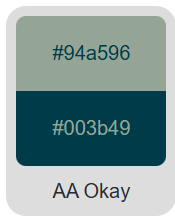
- Dark teal on gray
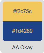
- Navy blue on yellow
Level AAA (High Accessibility)
Level AAA sets the strictest color contrast requirements in WCAG, 7:1 for normal text and 4.5:1 for large text. It’s designed to provide the highest level of readability, especially for users with significant visual impairments.
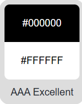
Black on white
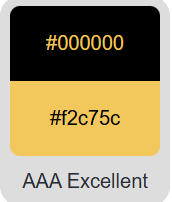
Dark brown on pale yellow
For more details refer to this documentation on color contrast.
WCAG’s Color Accessibility Guidelines
Accessible design needs clear contrast between colors. That is why WCAG guidelines exist. It outlines how to make your content easier to use for everyone. They come in three levels—A, AA, and AAA. Level A is basic. Level AA suits most websites. Level AAA gives the highest support for low-vision users.
- A – Minimal Accessibility
At this level, color contrast ratio is quite low. If color contrast is below 4.5:1 or below 3:1 for normal text and large text and graphics respectively, users may have difficulty as this makes it harder for people with vision issues to read or understand your content.
- AA – Strong Accessibility
This level is more suitable for everyday use. A contrast of 4.5:1 or higher works well for normal text, large text, and graphics. Most websites aim for this level to make their content more readable and accessible.
- AAA – Enhanced Accessibility
This level offers the best readability. A contrast of 7:1 for normal text and 4.5:1 for large text or graphics works great for users with low vision. Government websites often follow these high standards.
How to ensure Color Palette Accessibility of Website Design?
Making a website easy to use starts with the right colors. Thoughtful choices help everyone interact with your content, especially users with vision issues. Here is how you can ensure color palette accessibility of website design:
1. Ensure Sufficient Contrast: Pick colors that stand out. The text and background should not blend and have enough contrast. A distinct contrast aids individuals with low vision in reading more easily. For example, light writing on a dark backdrop, or vice versa, typically functions effectively.
2. Choose Colorblind-Friendly Colors: Some users cannot distinguish red from green or other similar shades. So, choose colors that show up clearly for all types of vision. Do not rely on color alone to share important details. Add icons, labels, or patterns to help users understand your content.
3. Check Colors in Light and Dark Mode: Most websites now have light and dark themes. Colors can look different in each mode. So, test your palette in both. Some shades may fade or become hard to see when the theme changes.
4. Test Colors in Real Use: Do not just look at color samples. Try them out in actual buttons, menus, and forms. View them on different screens and devices. This gives you a clear idea of how the colors work in real life situations.
5. Test Color Contrast against WCAG Guidelines
Use accessibility tools like BrowserStack Accessibility Design Toolkit to test color contrast. They show if your colors meet WCAG standards.
- For regular text, go for at least 4.5:1.
- For bold or large text, 3:1 is okay.
- For maximum clarity, aim for 7:1.
6. Adjust Colors for Compliance: If the contrast is too low, adjust the shades. Try making colors darker, lighter, or less saturated until they meet the rules.
7. Repeat Testing: Design changes can affect color contrast. So, test your palette again whenever you update your site. Regular checks help you stay accessible and user-friendly
Tools to generate Accessible Color Palette
Making your colors accessible is easier when you use the right tools. These tools help you check contrast and pick accessibility color palette that work for all types of users.
- Color Contrast Checker: This tool is quick and simple to use. You can test different color combinations right away. It also checks if your palette meets WCAG rules. You can create and test palettes in one place.
- WebAIM Contrast Checker: This one is great for comparing two colors. You just enter the values and it shows if they pass AA or AAA levels. It is clear and easy to read.
- Accessible Colors: If you already have brand colors, this tool helps. You enter your colors, and it shows similar ones with better contrast. That way, you stay on-brand while making it easier to read.
- Color Safe: Color Safe helps you build palettes with accessibility in mind. You pick a background color, and it gives you text options that meet WCAG standards. It is helpful for clean and readable design.
- Tanaguru Contrast Finder: When your color pair fails the contrast test, this tool steps in. It finds a close match that still looks good. The new combo keeps your style while meeting contrast rules.
- Adobe Color: Adobe Color gives you more control. You can build your own themes, test contrast, and even see how colors look to people with color blindness. It is great for designers who want more options.
Why choose BrowserStack to Test Color Palette Accessibility?
Choosing the right color palette is key to creating an inclusive digital experience. But it’s equally important to ensure that your colors meet accessibility standards, especially for users with visual impairments.
BrowserStack Accessibility Design Toolkit makes this easy. It helps designers create accessible, user-friendly digital experiences from the start. It provides easy-to-use tools and guidelines to ensure your designs meet WCAG standards and are inclusive for all users.
It helps you test your website’s color contrast against WCAG guidelines and instantly highlights areas that don’t meet accessibility standards. This allows designers and developers to quickly adjust colors, improve readability, and ensure their website is usable for everyone.
Key Benefits of BrowserStack Accessibility Design Toolkit:
- Design and Validate Accessible UI Components: Automatically check color contrast, focus order, alt texts, component states, and generate accessible design specs with ARIA attributes.
- Get Actionable Accessibility Guidance: Use built-in checklists, WCAG compliance checks, and best-practice recommendations to go beyond basic standards and create truly inclusive designs.
- Smooth Handoff from Design to Development: Share annotated design files with developers, complete with component guidelines, accessibility documentation, and auto-generated specs for faster, accurate implementation.
Read More: Web Accessibility Best Practices
Best Practices for implementing Color Palette Accessibility
Here are some of the best practices for implementing color palette accessibility:
1. Avoid Color Combos That Are Hard to Tell Apart
Some color pairs can be tricky for people with color blindness. Red, green, brown, blue, gray, or green and black often blend together. When used together, these colors may blur visually.
Still, you do not always have to skip them. A few simple changes can help:
- Make one of the colors lighter or darker to create more contrast.
- Use patterns or textures to separate areas instead of relying only on color.
- Add borders or outlines to help the colors stand out.
- Include icons, labels, or other visual hints to make things clearer.
2. Use White or Dark Space to Separate
A quick fix is to break up these colors with space. White or dark space between sections helps make each part stand out. This gives the eyes a break and adds clarity.
Most ready-made templates use this method well. If unsure, try entering the color using an accessibility tool. It will show you which shades work better with it.
3. Add Icons, Labels, or Patterns
Never use color alone to show meaning. It is better to add more visual cues. This is especially useful in forms, charts, and warning messages.
For example, do not just color a link blue. Underline it too. That way, users know it is clickable.
If there is an error, show an icon or a label. That makes it easier for everyone to understand.
Conclusion
Accessible color choices are not just about how your site looks. They make sure everyone can use it with ease—even those with vision challenges or color blindness.
It starts with clear contrast and smart color combinations. But it should not stop there. Add helpful touches like labels, icons, and spacing to support users who may not rely on color alone.
Test your palette across real devices, themes, and real-world situations. That way, no one gets left behind. Designing this way shows care. It builds trust. And it makes your site feel welcoming to all.
Try BrowserStack Accessibility
FAQs
1. What is an accessible color palette?
It is a set of colors that works well for everyone, including people with color blindness or low vision. These palettes meet contrast standards, so nothing gets lost on the screen.
2. Why does color contrast matter in web design?
Good contrast makes text and elements easier to see. It helps users read, click, and interact without straining their eyes.
3. What contrast ratio should you aim for?
For regular text, aim for at least 4.5:1. If the text is bold or large, 3:1 can also work.
4. Can red and green be used together?
Red and green can be used together, but with caution. Around 1 in 12 men and 1 in 200 women have red-green color blindness, which can make it hard to distinguish between the two.
Add labels, icons, or patterns so users who cannot see the difference can still understand it.

